When Pictures and Language Combine
In my last blog post, I talked about how image making is just one big love letter to the human experience. Now I want to get into what language that letter might be written in. To do so, let's start with abstraction.
So what exactly is abstract image making? For the purposes of this blog, I'm going to define it as the creation of images that are characterized by nondescript and often simplistic shapes. Because of these qualities, it has the capacity to be easily recognizable, relateable, and/or reproducible, all excellent traits for facilitating communication. This is especially evident in early languages where writing and drawing frequently meant the same thing.

But communication requires not just form, but meaning. Sooo… how do you build meaning into an image? Especially highly abstracted ones? Like words, reading an image requires a learned vocabulary and must be related to by borrowing from common visual/human experiences. It could be a common natural experience:
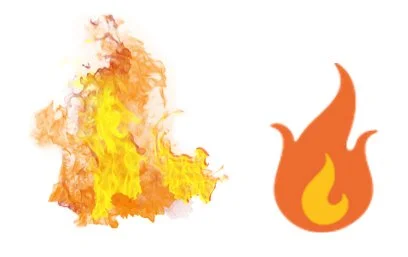
Note how the icon takes the most important characteristics that define the subject and exaggerates it.
Or a man-made one:
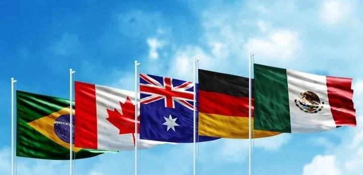
Note that because experiences associated with a nation can vary widely (as opposed to something as universal as “fire”), a flag might mean something completely different to different people.
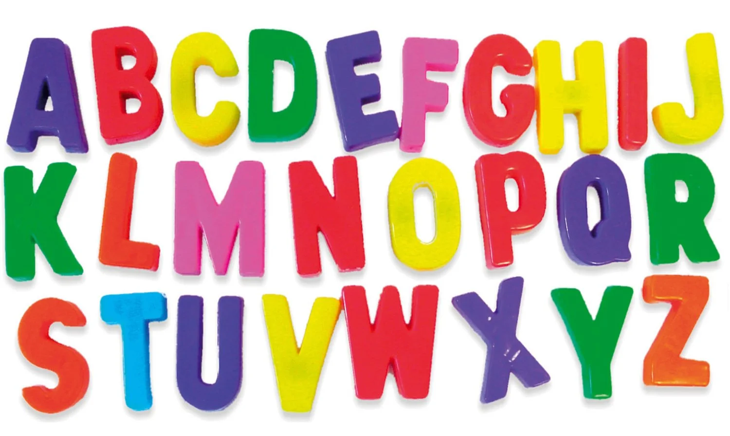
Speaking of repetitive association, one interesting subset of abstracted imagery is the alphabet (or really any other modular visual system, like sheet music). Each letter is purposefully designed to hold little to no meaning on its own so that a combination of its form can be used as an empty shell to fill with meaning.
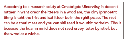
Because of this, the line between the written word and icon are understandably blurry. At first it might not seem that way (at least for English) because we think of it as “reading” words and “seeing” pictures, however research has shown that we seem to process familiar words similarly to the way we process icons. Below, you can see it illustrated in a passage:
In fact, typography and logo design are built on top of these principles.


Interestingly, because of this splitting between text and icon, some concepts are easier to convey through text, and others through iconography. This is why situations that require getting the quickest, clearest read oftentimes utilize a combination of different forms of image making.
Sometimes, what started off as an abstract image paired with text might even garner so much cultural relevance through repetitive association that its meaning becomes ubiquitous. When this happens, the text is often times dropped, because it’s safe to assume that everyone already knows what the image means. By examining which concepts and icons receive this sort of treatment we can really start to see what defines a particular culture.
Below is a really simplified flowchart summarizing the ideas discussed above.