Simplicity… When, Where, and How?
Okay, so now that we’ve laid out what abstract image making is, let’s look at how it’s applied in contemporary American culture.
One really cool cultural read on abstraction is the perception of images that are usually made up of simple shapes. Depending on a few very subtle factors, a simple abstract image can give off two completely different vibes: Sleek/professional or child-like.
Can we appreciate that for a second? Based on a few little tweaks, an image can be read in completely OPPOSITE ways. You can see it clearly from Disney, who wants to be read as both professional and child-like, depending on the situation.
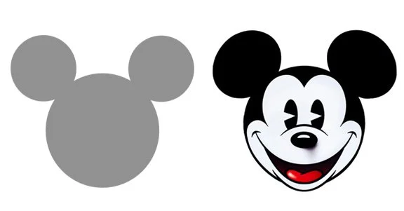
The way that this is achieved can be broken into two . The more handmade and personal the subject looks, the more it’s associated with “child-like”. Conversely, the more machine-made and impersonal the subject looks, the more it’s associated with “professional”. To accentuate this machine-made effect, lots of straight/uniform lines are used and as much of the face is omitted as possible (the eyes are almost always the first to go).
The line between these two forms of abstraction are also incredibly fine. Below are some examples of this. Left is “professional”; right is “child-like”.
It’s interesting to see how this plays out in the fine arts. Since much of it has moved toward abstraction with the rise of photography, it makes a lot of sense that the perception of it whiplashes between “conceptually sophisticated” and “my child could do this”. Depending on whether or not the viewer was exposed to the “sophisticated” concepts that re-contextualize abstract work with meaning (that’s usually exclusively held within upper class culture), the default interpretation of non-machine made abstract work is commonly “child-like”.
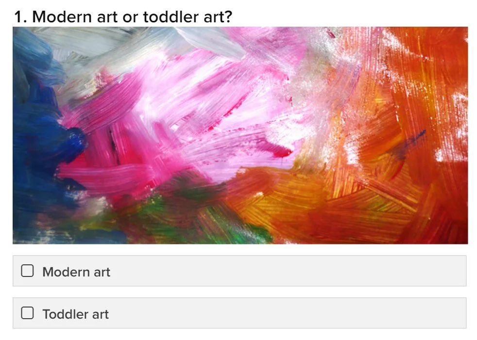
Click image to take the quiz!
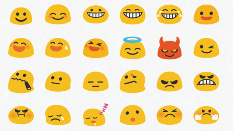
Emojis also face a conundrum from the same dichotomy of abstract image making, but expressed in a different way. More than ever, we are communicating through writing, which inherently has a degree of separation that causes crucial aspects of conversation like tone of voice to be lost. Emojis are the perfect shorthand to express that piece of information with minimal effort, however, because they look personable and friendly, emojis are often times seen as “childish” to use in professional settings.
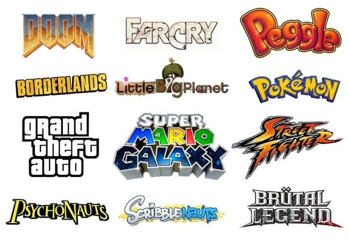
Bar these (and I’m sure other) exceptions, generally with the rise of computers and automation, the impersonal and clean cut has become representative of progress, technology, economy, state of the art, and sleek. This can be seen in the rapid move toward simplifying logos in companies that want to brand themselves as such.
I want to end by mentioning that it’s a bit of a misguided notion to think of minimal treatment as an all-purpose improvement. Though our current prevailing culture as a whole values “tech/sleek/progress”, we have to be aware of when those principles are inappropriate for a situation and when it calls for more literal and organic imagery. Examples can be drawn from when a brand or theme wants to evoke the opposite meaning of “technology”, “economy”, “state of the art”, and “sleek”.
Some themes include “play”:
…”Natural/home-grown/not over-processed”:

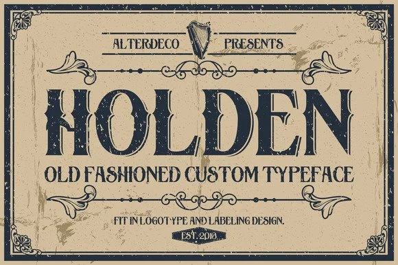
…”Traditional/Old/Vintage”:
…And “spectacle”:

On that note, it’s important to remember that just because abstract image making (at least in current American culture) holds this sort of meaning right now, it is always subject to change. These are just some observations I’ve made so far, but who knows how abstraction will be used in the future!
Anyways, I hope you found this as interesting as I did. Thanks for reading!